I love beautiful design. Though I’m no longer a web designer, I still find myself crawling around the Web at times, looking for examples of beautiful and inspiring design. I came across just such a thing a little while ago in the NeuYear calendar. It begin its life as a Kickstarter project and, once fully funded, came to life. I ordered one as soon as I could and can testify that it’s everything it’s cracked up to be. I’m all about clean and minimal design and this calendar is just that.
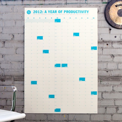
After I ordered a calendar, Jesse Phillips, the entrepreneur behind the project, got in touch to say that he has been known to hang around my blog and that he’d love to give away some calendars to the readers of the site. In fact, he has offered up 20 of them!
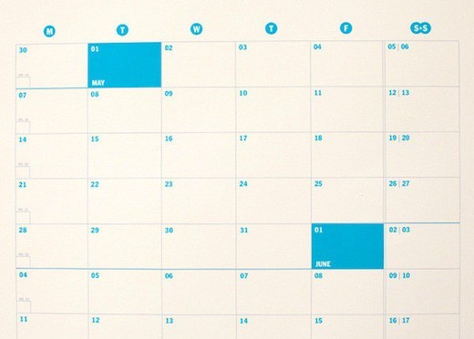
What’s special about the NeuYear calendar? First, it’s big, which means you can see the whole year at a glance. Second, it’s gapless, which means that it’s more of a year-by-week than a year-by-month kind of calendar (which appeals to me since weeks are more meaningful to my workflow than months). Third, it’s beautiful; it’s just a great design. And fourth, it’s 2 calendars in 1 since the one side has the calendar in horizontal format and the other has it in the vertical format.
There are 20 to win, so go ahead and sign up. The giveaway closes Wednesday at 6 PM EST. You will be notified by email if you are one of the winners.

