As you may have noticed, unless you’re on of those people who only reads the site via RSS, I have done a fairly major revision to the layout of the site. While leaving the design much the same (if it ain’t broke…) I added a new sidebar which contains all sorts of good information.
Most important is the SideBlog. I have often lamented (though only to myself) that the format of my blog is not conducive to post multiple short entries to the blog. The site is created for articles more than for news-bytes. The SideBlog gives me the ability to post tidbits: links to other sites, nearly-insignificant thoughts, and so on. It also allows people using RSS if they’d like to subscribe to that blog or only the main one.
I also added a list of recent Trackbacks. These are links to other bloggers who have recently referenced a post on my site. They may be talking about me or about you (the people having the discussion). It is fun to watch how discussions filter across the Internet and I thought this would be a good way of keeping tabs on that.
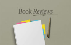
Finally, I added a list of books I am currently reading. I may remove this in favor of something else if and when I think of it.
Despite the use of some reasonably complex CSS (code) I trust most browsers will be able to cope with the changes. Those of you using 800×600 resolution (which appears to be only about 16% of users) now have another good reason to upgrade to a bigger monitor or a higher resolution. The site will still look fine, but the SideBlog will be off the screen to the right.
Feel free to let me know your thoughts, especially if you have other ideas about what I might do with that space.
