During the past few weeks I’ve been asked many questions about blogging and other forms of writing, so thought I’d tell you about the three tools I consider essential to my writing life. There’s an app, a font, and a calendar that represent the heart of all I do.
The App: Ulysses
For many years now, the great majority of my writing has been done in an app called Ulysses. This is a Mac-only app, though iA Writer is a solid equivalent for Windows.
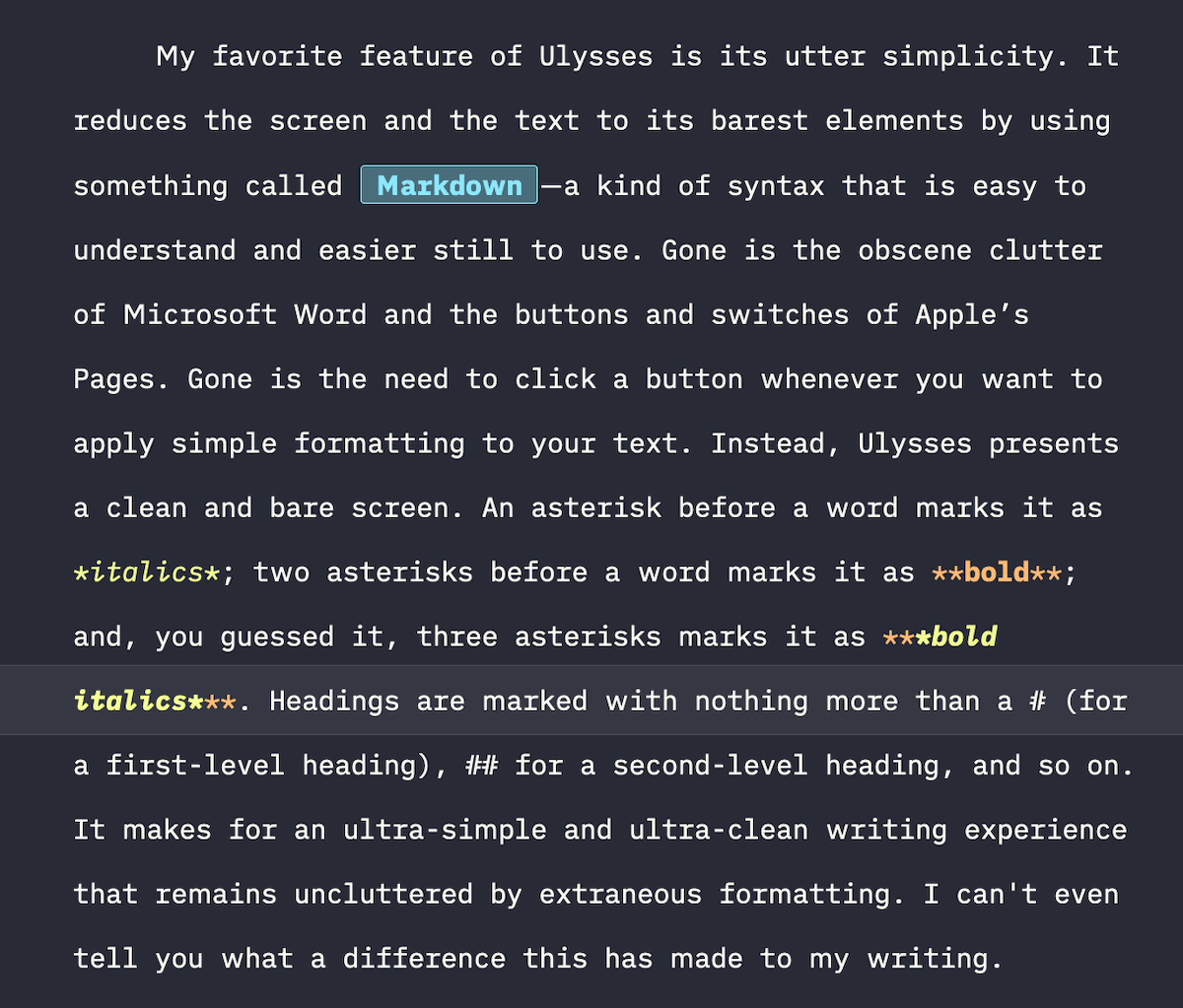
My favorite feature of Ulysses is its utter simplicity. It reduces the screen and the text to its barest elements by using something called Markdown—a kind of syntax that is easy to understand and easier still to use. Gone is the obscene clutter of Microsoft Word and the buttons and switches of Apple’s Pages. Gone is the need to click a button whenever you want to apply simple formatting to your text. Instead, Ulysses presents a clean and bare screen. An asterisk before a word marks it as italics; two asterisks before a word marks it as bold; and, you guessed it, three asterisks marks it as bold italics. Headings are marked with nothing more than a # (for a first-level heading), ## for a second-level heading, and so on. It makes for an ultra-simple and ultra-clean writing experience that remains uncluttered by extraneous formatting. I can’t even tell you what a difference this has made to my writing.
Another key benefit of Ulysses is the way it completely separates the formatting of what you see on your screen from what you will see later on the printed page. Again, when you open Ulysses to write, you can just write. You don’t need to concern yourself about how it will look later when it comes time to save it as a PDF or when it comes time to print it. Just write. And then there is this: it perfectly and seamlessly syncs between devices. A key to successful writing is always having the ability to begin a new thought or add to an existing one, and by having Ulysses on all my devices, I’m never more than a few seconds away from being able to get my ideas into my app.
There is no higher compliment I can pay to the software than this: It simply allows me to write.
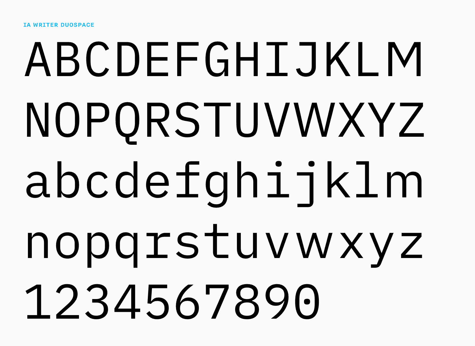
The Font: iA Writer Duospace
We often overlook fonts, but they can play a significant role in both writing and reading. Every computer comes with a collection of fonts, some of which are wonderful and some of which are horrible, but for writing I don’t think any equals iA Writer Duospace. As you may surmise, this font was created by the people behind the iA Writer app, but they made it freely available to whoever wants it. They offer a couple of other font options as well, but I find Duospace the best. Here’s what they say about it: “Proportional fonts are optimized for high reading speed. That makes them the perfect choice for reading. Good writing, on the other hand, is measured, reflected, slow. It takes one step at a time. In a monospace font every letter, every number, every punctuation mark and every space takes the same visual space, which slows us down. And, for writing that’s a good thing.” This font is a slight adaptation (hence “duospace”) but a brilliant one, that carries that same deliberate, slow-me-down form. It’s simple and free to download and install.
The Calendar: Trello
I use Trello as my editorial calendar. I have already written about this at some length so will provide just a brief summary here.
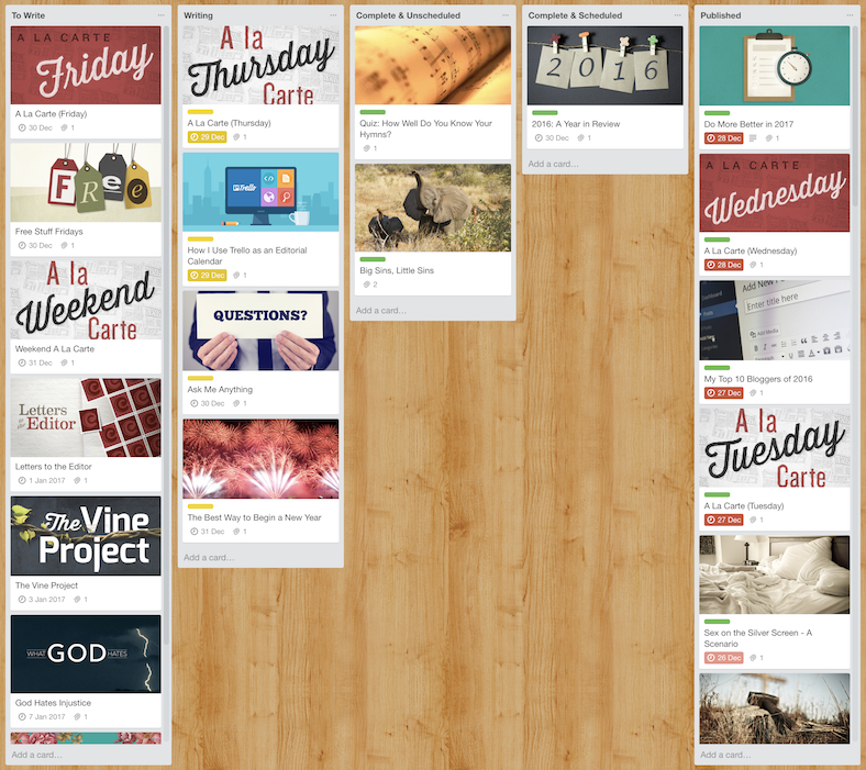
An editorial calendar is a means of organizing current and future writing projects to take them from conception to publication. Trello uses the kanban board paradigm to organize projects. A kanban board is based on three elements: A board, a number of lists, and a number of cards. The board represents the project, the lists represent the steps to completion, and the cards represent the specific tasks. As tasks progress, their cards move from the left side of the board to the right. It’s very intuitive and very effective. For my purposes, vague ideas for an article go on a list to the left side of the board and as they progress through writing, editing, scheduling, and publication they move progressively to the right. The left-most side of the board is Ideas and the right-most side of the board is Published. Here’s how it looked when I wrote my full-length article:
I recommend an editorial calendar to any writer, and especially any writer who wants to get more serious about the craft. You can find the template I based my calendar on at Trello.
The Rest
Like pretty much every other blog, mine uses WordPress as a content management system. I’ve customized it a little bit, but it basically relies on basic WordPress with a custom theme and a long list of plugins. It is hosted and maintained by Mere.
I accompany my articles with photos, and for those I rely mostly on Lightstock and Unsplash. Lightstock requires a subscription but boasts some not-too-cheesy church-related photos. Unsplash is free and awesome but isn’t as useful if you’re looking for a photo that will accompany an abstract idea (like encouragement, or church history, or sanctification).
I do most of my writing on an iMac that’s getting a bit old, but is holding up just fine. On the road I often use an iPad, which is also pretty old and still working well. When I’m out and about and need to jot down some ideas, I use Ulysses on my iPhone.
I find MindNode a helpful tool for plotting out series or pretty much anything else that is long and complicated.
